

Selected art and creative works
Walk into Lorena's art gallery, showcasing various artworks ranging from oil pastels, collages, graphic designs, and other mediums of art. I’m always exploring new ways to approach art, whether it's through its history or my fascination with learning.
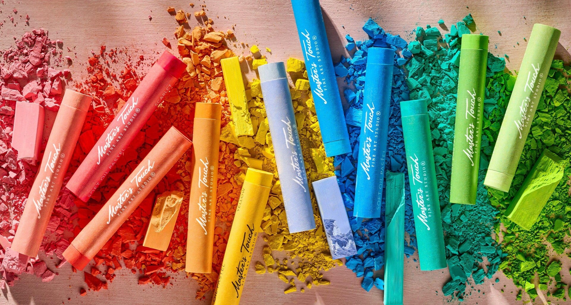
Oil Pastel
Oil pastels are a messier version of a crayon, having a creamier, non-drying base of oil and wax, which is used as a binder for the dry pigment. This makes it easier to mix when layered with other colors, and it is seen as both an advantage and a drawback when used. The advantage is smooth gradients from color to color; the downside is that because oil pastels can't dry, you have to be careful when handling them when you're done using them. There are, of course, remedies for this, but they should be treated with caution.
Studies in Oil Pastel
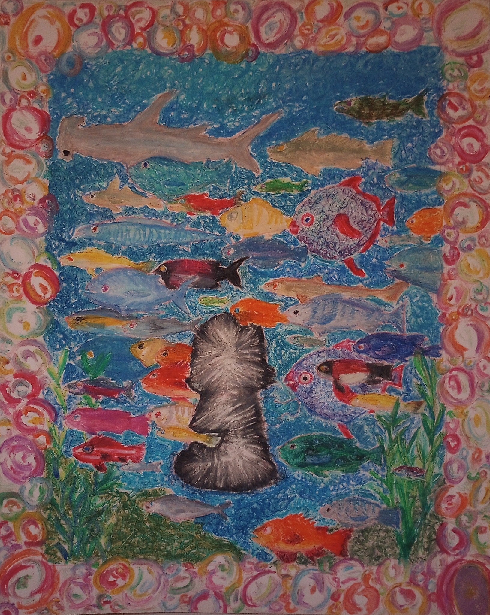
Busy City, 2024
11x14
Oil pastel on paper
Busy City was made in hopes of being showcased in the 2024 New Voices exhibit at the Vincent Price Art Museum, sadly it wasn't chosen but it was a fun piece to make. I was gifted a cheap oil pastel set by my sister for Christmas and desperately wanted to use it again but didn't have the motivation to start. But when my drawing Professor announced the annual New Voices exhibit, it gave me the push to use it again. I wanted to draw a school of fish, all various types, while having something in the middle. I came to the conclusion of having a little girl in the middle. At first, she was going to be a black silhouette, but I liked the visual aspect of having a white glow in the middle. Lastly, I added a bubble border as a last-minute detail.
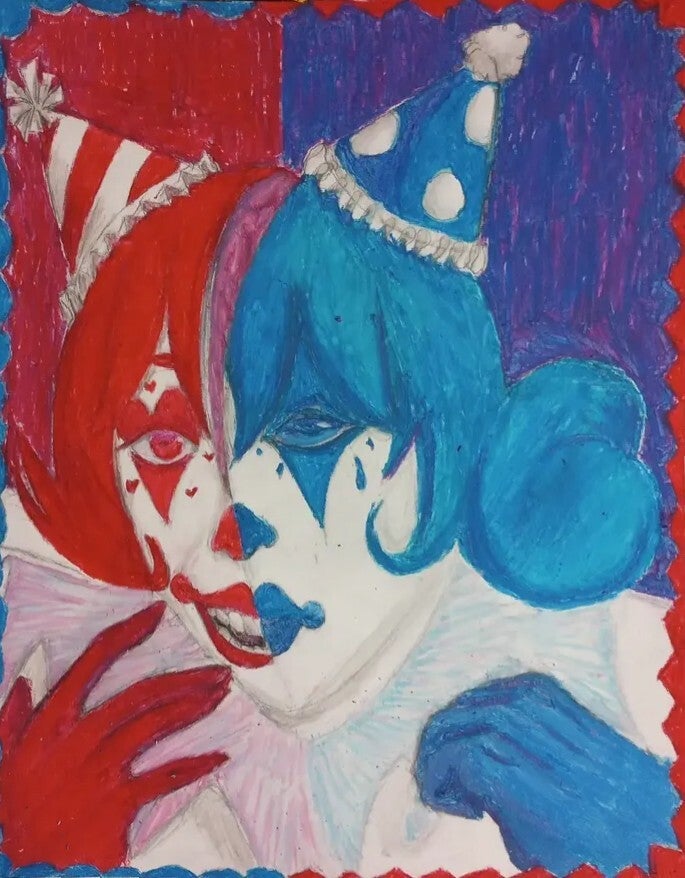
Two Faced, 2024
11x14
Oil pastel on paper
Two Faced was an oil pastel drawing that I made as a senior in high school for the annual Maxine Waters’ Congressional Art Competition. I obviously didn’t win, but I had fun drawing it. I, for some reason, really wanted to draw a clown while having two faces contrasting the other. I first drew out a sketch, and they began to color in the design. It wasn’t a good idea since I can still see the pencil marks, but I think the color makes up for that. Fun fact: This drawing took over a year to get back to me since the people at Waters' office said that they didn’t want to ruin the piece when sending it through the mail since it was a big drawing. But they didn’t even send an email to my teacher informing her about it. So I was the one sending messages to the Water’s website about wanting my art piece back, sending a message every few months with no response. It wasn’t until the next annual competition came around and I emailed the field representative who gave me the contact info to Water’s district office. I called and emailed them, and we set up a date to pick up the artwork. I received a goody bag with an amendment book, pencils, 2 Metro pens (they’re the best pens I have ever owned), 2 Blick gift cards, and some other knick-knacks. I was looking forward to getting snacks, but this was good too. In the end, I did win something; it just had to take over a year to get it.
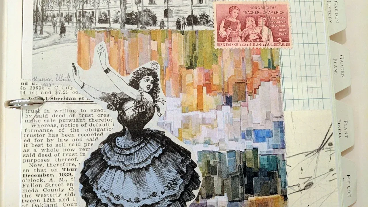
Collage
Collages are formed that take pre-existing media like magazines, newspapers, pictures, plants, and many more and removes it from its context to create a new meaning. It was popularized during the Dada movement in the 1910s. A good example of this would be Hannah Höch's, Cut with the Dada Kitchen Knife through the Last Weimar Beer-Belly Cultural Epoch in Germany, 1919. However, it has been around for centuries and has continued to be a staple in Contemporary Art today. It can be seen as both a fun activity and an artistic endeavor. Many people use it when scrap-booking, making a vision board, or for an art assignment.
Paper collages
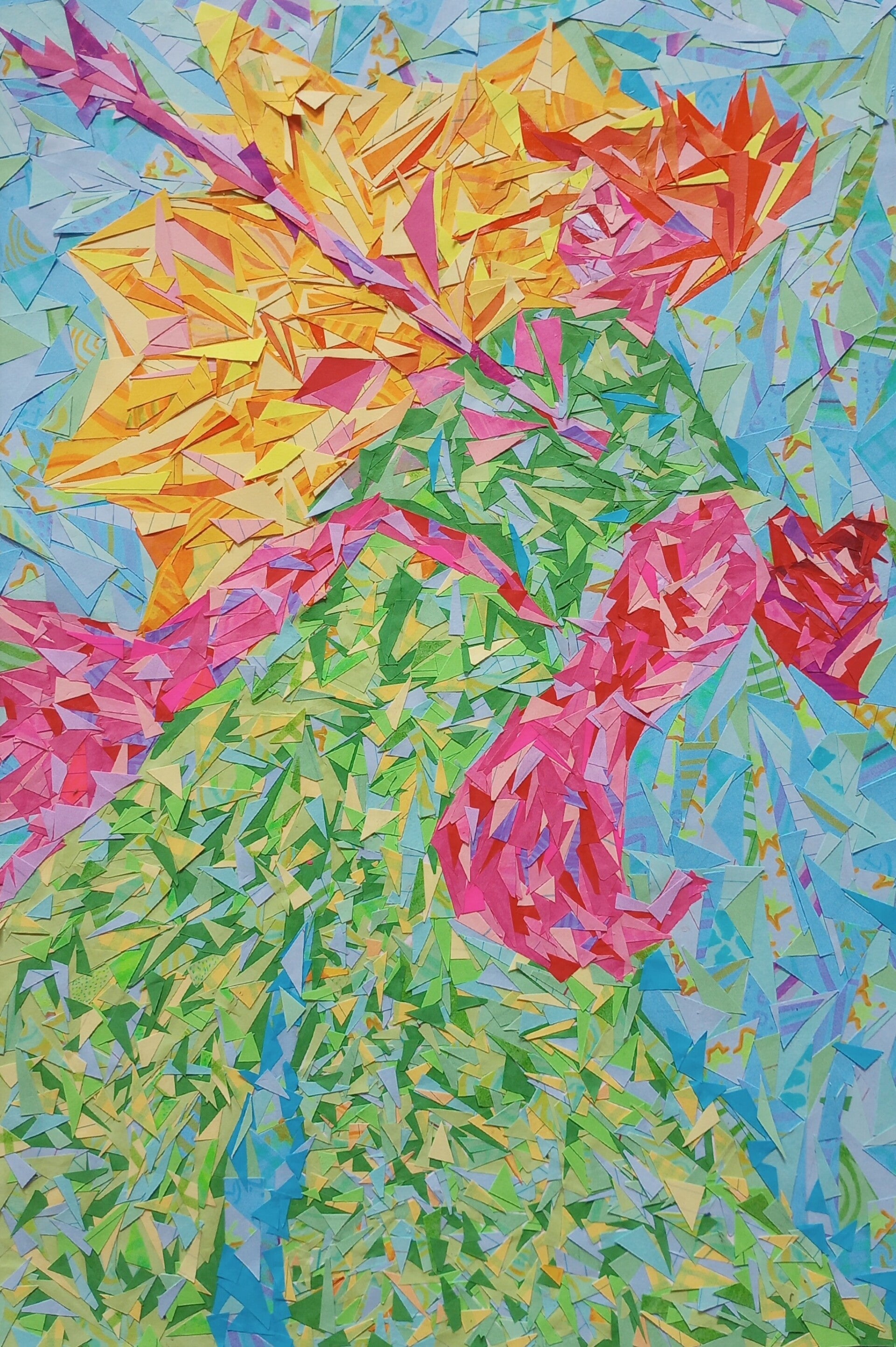
Heart Struck, 2024
9x12
Colored paper on paper
Heart Struck was made as an art assignment for my color theory class, and this week we were trying to emulate the mixing of colors through stippling two different colors to trick the eye into mixing them for us. However, I wanted to be difficult and use triangles instead of circles to do the stippling effect. Of course, I would have a better chance at optically mixing the colors if the triangles were cut smaller. But even though I failed miserably with optical color mixing, the piece still turned out nice as a somewhat abstract-cubist piece. The piece itself has no real meaning; I just made it because it was an idea in my mind. But there doesn’t need to be a meaning behind it; something we just make art for the sake of it. Ps. I still have a mountain of unused flashcards left over because of this assignment. I am now letting my sister use them to make flashcards to study for her nursing exams.
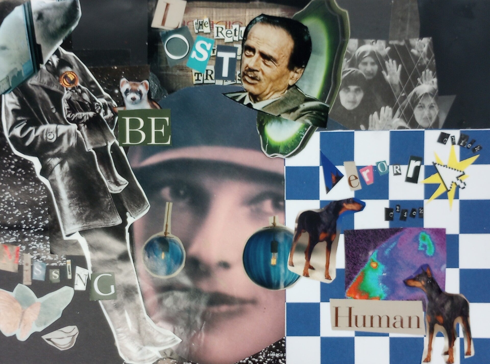
Is that you, Amelia? 2024
8.5x11
Cut magazine on paper
Is that you, Amelia? Is a collage piece I made for my drawing class final, it was meant to serve as a reference for when we had to draw an upscale version in charcoal using a grid method. My professor (the one who announced the VPAM New Voices exhibit) let us go through various art, historical, architectural, and natural geographic magazines to create our collage. I personally enjoy making collages since, for me, it's about looking at images I like, cutting them out, and figuring out how to make them work with each other. Essentially, I'm just going through the flow when it comes to making collages, and the meaning is what the viewer makes of it. I love how I used salt as a background piece, and it looks like a group of stars. Collage is all about one's interpretations.
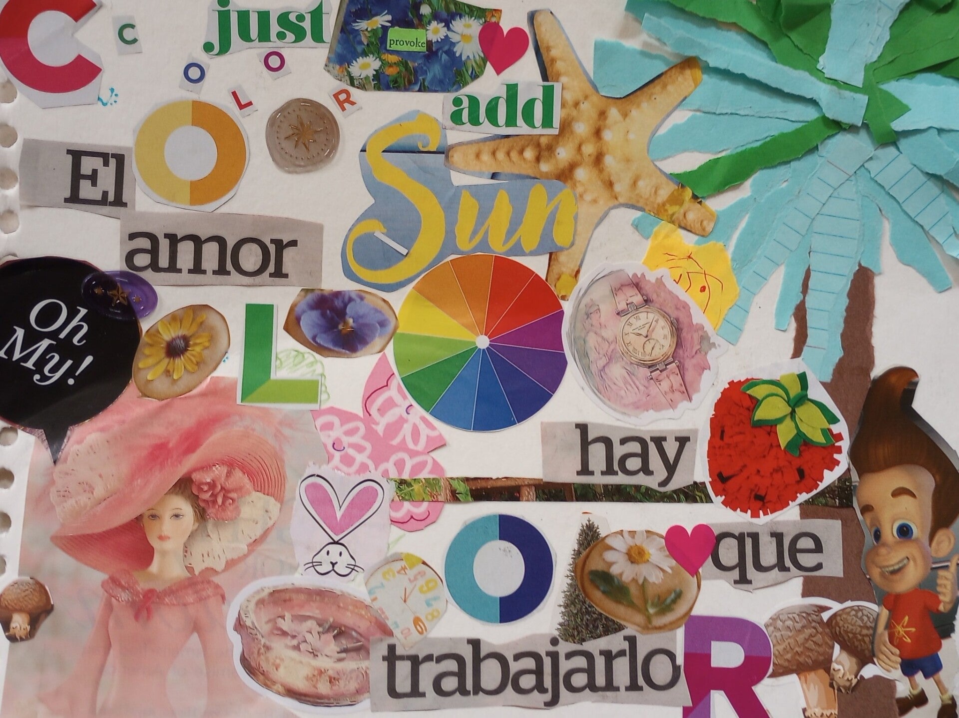
BMW Jimmy Neutron, 2024
8.5x11
Cut magazine, flashcards, construction paper on paper
BMW Jimmy Neutron was a collage I made when my sister took me with her to a club meeting with some of her public health classmates. It was a nice sunny day, and we had a picnic-like group vision board activity at Exposition Park. We looked at garden magazines and brought a chunk of my unused flashcards and construction paper. We talked about what we wanted to do in the future and what our goals were. At the end, when we were all done, we went around and talked about what we put into the collage and why. For me, I’m an art student and wanted to put color into my design while wanting to show the weird and unique aspects of my art that I wanted to explore. I also found an image of Jimmy Neutron and one of the magazines, and he was next to a BMW, so I cut him out, and I believe you could still see part of the car in the background. Overall, it was a nice day, and I want to experience it again with my sister.
Graphic Design
Graphic Design is a visual way to communicate ideas to viewers using images, typography, and the Gestalt principles of design. A designer's ultimate goal is to entice the viewer to look at their design. Every design serves the purpose whether it's to buy the trending clothes, read the latest news, or to spread propaganda. There are levels to graphic design, like UX, UI, branding, marketing, illustration, publication, and packaging.
Graphics
Olive, Where Are You? 2025
8.5x11
Adobe Illustration
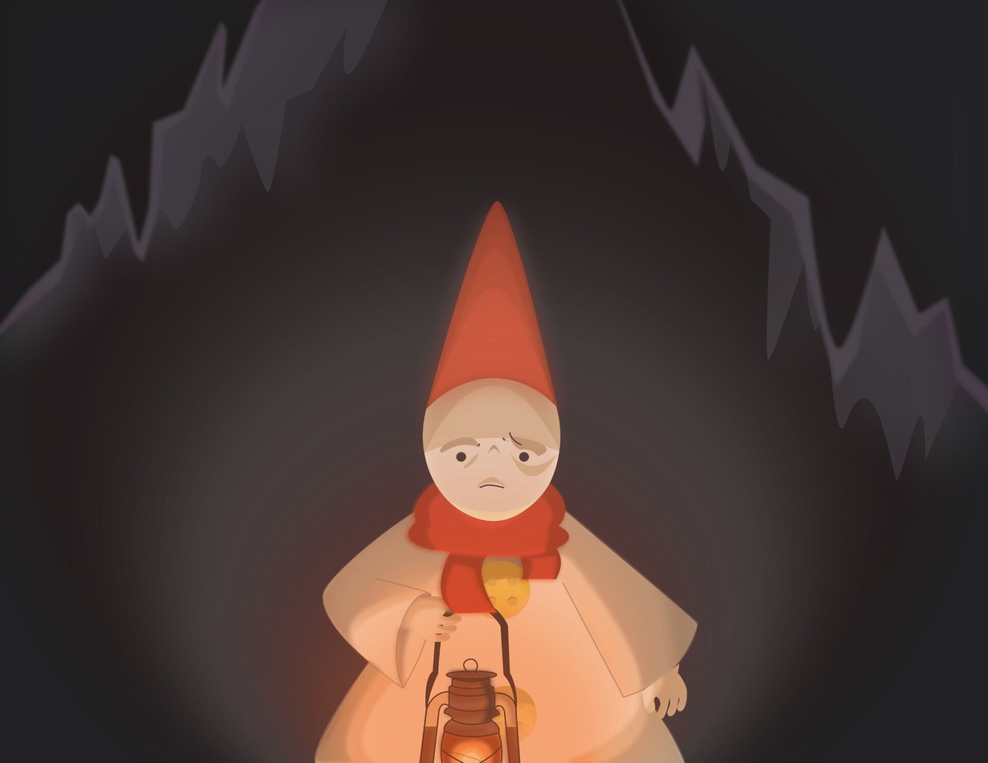
Olive, Where Are You? Was a digital drawing I made for my VC 129 class. The assignment was to draw a preexisting or original character using Adobe Illustrator. I drew my character Olive in a cave using a lantern to light the way. Up until this point, I had a basic understanding of Illustrator, and at first the sketch looked a bit of a mess, but after a while of working in class and at the school library, I was able to make the piece look better. I had to trace an image of a lantern, but everything else was just basic shapes. I had a lot of fun with the lighting and used a reference for the face, but I noticed that I forgot to color in a section of the lantern, but not everything is going to come out perfectly. I did have to leave early due to a doctor's appointment, which was sad because I always look forward to seeing other people’s work, but there's no point crying over spilled milk. I'm happy I at least got to see some work before I left.
Spotlight, 2025
8.5x11
Photoshop Graphic
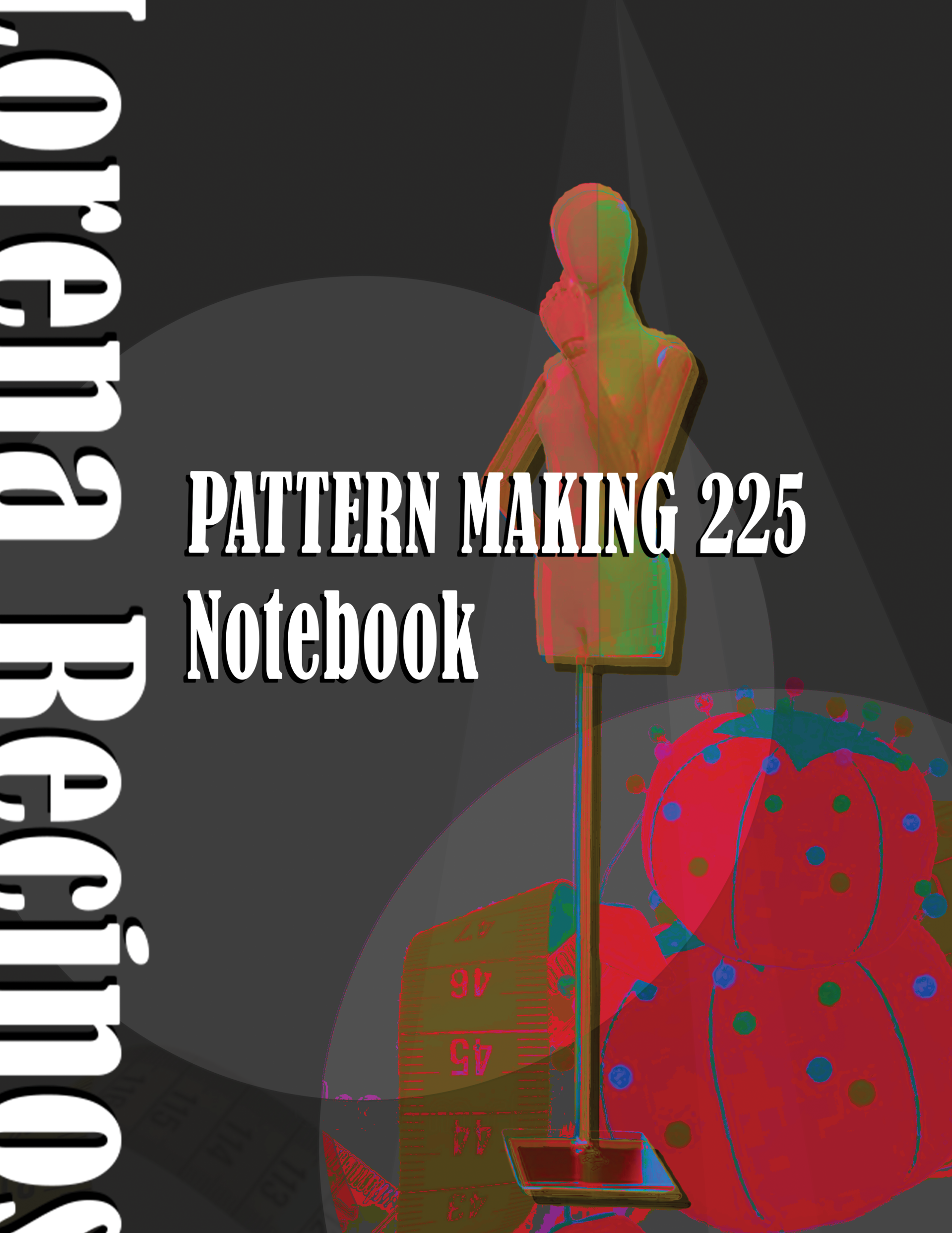
Spotlight was my Pattern Making 225 notebook cover, made as part of my final for my pattern making class. I knew I wanted a mannequin in my design, so it was the first thing I looked up. I downloaded one I liked and then went looking for sewing equipment or things that are used in pattern making, like a measuring tape or a pincushion to hold all the pins we used. Afterwards, it was only rearranging the elements and playing with the Photoshop filters and masks to achieve the look I wanted. I added a black background because I wanted the mannequin to look like it’s on a stage and at the same time to help make the elements pop. I found out that if I put a circle on top of the mask, it would lighten parts of the figure. I tried to do the same thing with the triangles, but I didn’t like the look, so I kept them all white. I put the title in the middle since it was the most important part of the cover, and duplicated the text and made it black to make the white text pop out more from the background. I picked a bold, tall, and somewhat wide font because it complemented the artwork in the background. I believe I used a western-style font. I didn’t want the title to be long or bulky so adding my name to the empty side of the cover so that it would balance out the composition. I was fine with my name being slightly cut off since it gave the cover some more visual interest, and my name is still legible despite being partially cut off. Overall, I am very proud of my cover, and it’s all because of the Photoshop class, among other Graphic Design courses, I took to be able to achieve this. They were the building blocks to help me bring my ideas to life.
Crochet
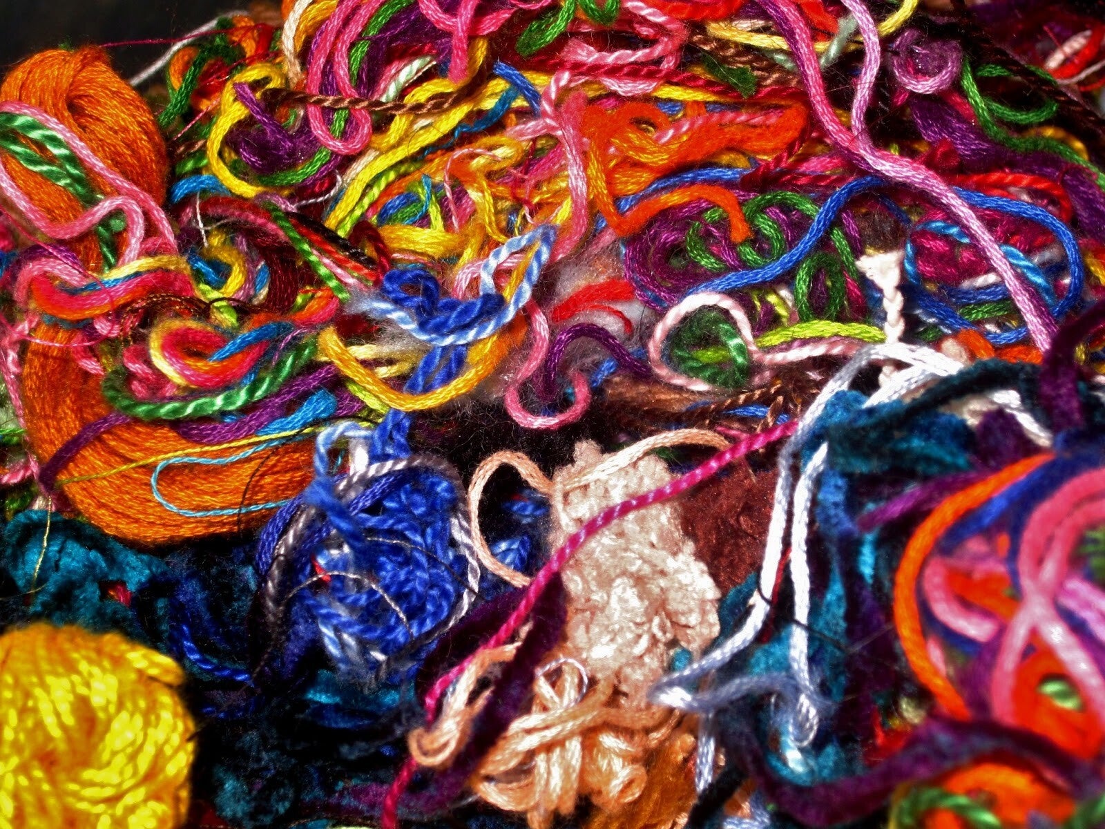
Crochet is a type of textile art that uses yarn and a single hook to create interlocking loops of fabric, coming from the old French word croche meaning to hook. Crochet can use different types of fibers ranging from natural, like wool or cotton, to synthetic, like nylon or acrylic. There is also the use of different hook sizes that are used to accommodate different yarn thickness, or different fabric styles.
Handmade crochet and fiber textures
LMK Crochet Monkeys, 2025
4x2 Each
Acrylic yarn
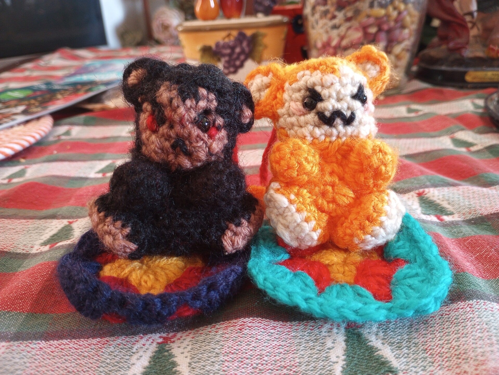
LMK crochet monkeys was a crochet gift I started to give to a friend because I felt like it. During the summer, I was taking a biology class at Elac, and after the class I would sometimes go exploring around the stores, one of them being Daiso, and they had a section dedicated to crochet, and I thought, “I do want to try crocheting something and went along with my day. A few days go by, and when my class ended, I sat on the stairs and started thinking, and I thought about how my friend really likes a show called Lego Monkey Kid, and I thought to myself, “Why don’t I make them two crochet figures of their two favorite characters? I mean, they're obsessed with the show. Why not make them something they’ll love? Daiso has yarn and hooks, and I can learn how to crochet, but it can’t be that hard.” So I got up, went to Daiso, bought the yarn and hooks with my lunch money, and went home to learn a new skill. I started off with a pink square, and it didn’t look good, and I thought, “Why don’t I just start? This is taking too long.” I searched for a tutorial I liked, which was in a language I didn’t even understand, so I just stared intently to see what the person did. It took me months to make them; I even had to go downtown to buy some eyes because I didn’t want to sew them. But what gave me the motivation to finish was when my friend and I decided to go buy ice cream and eat it at the park, so I finished sewing the pieces together and even made granny squares out of the yarn colors I didn’t use that still correspond to the characters, wrapped it up in a gift box, and had them open it. I told them not to flip the package around because there was a see-through part on the box, and when they flipped it over, they were quiet for a while, looking at the two messy-looking monkeys, smiled, were awed at them, and gave me a hug. They were keychains so they could hang them on their bag, and when they weren’t hanging, they could be sat down on their mini blankets. They still have them hanging on their bag and take them everywhere with them; I’m glad they like their gift.
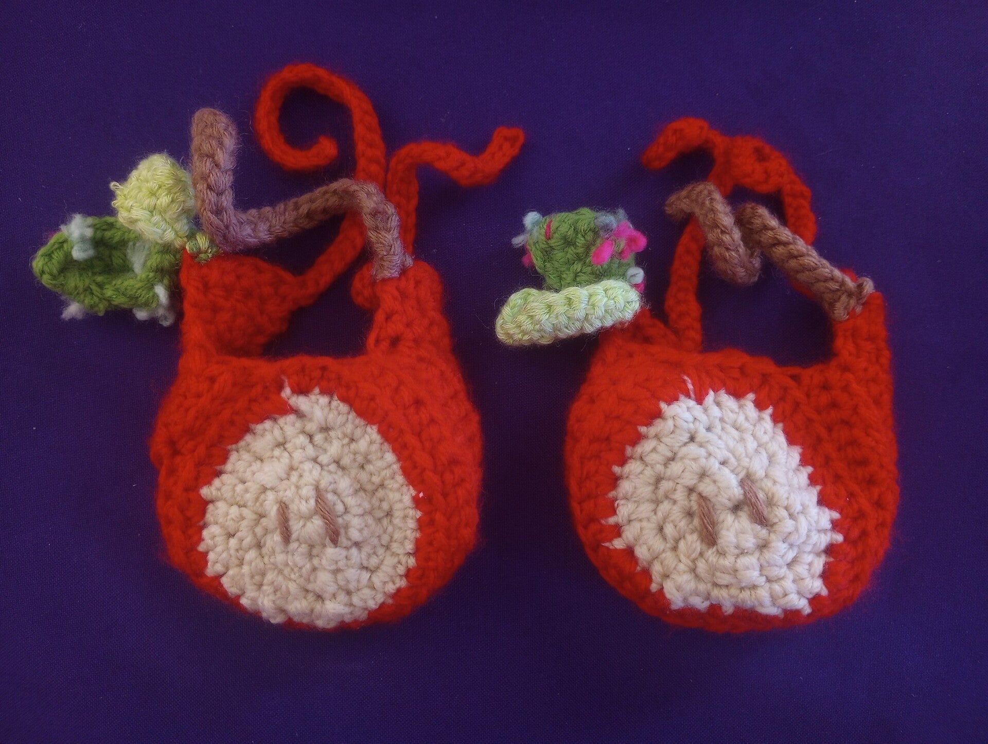
Apple Head Covers, 2026
4x7 Each
Acrylic yarn
Ever since I learned a new skill, my sister has been telling me to make her headphone covers for her headphones. She gave me a tutorial to follow and after a few weeks of work I was mid way though fishing them all I needed was green yarn for the leaves. So after we finished going to the gym, we went to Michael’s to look at green yarn that would match the apples. I had taken the apple to see which was the best green to use, and we picked out two nice greens. Then we went to pay for them, and my sister and her sticky fingers were touching all of the plushies on display, playing with the balls, and goofing around, which made waiting a lot more fun because there was a woman who was taking a while to pay for her things. We laughed and played like unsupervised children until it was our turn to pay, and I kept asking her if she wanted to buy one of the balls, to which she responded with a “no” (but when we got home, she talked about how she wanted to buy the ball). Then, when I was paying, her sister said, “Happy Halloween" in a squeaky, childlike voice. I turned around and went, “What are you even looking at?” She responded, “I was reading the banner,” which made the cashier smile. I swear we're like children in a candy store. Either way, I finished up making the headphone covers, sewed up her messed-up headphones, and now she's using them whenever she’s out and about.
Paintings
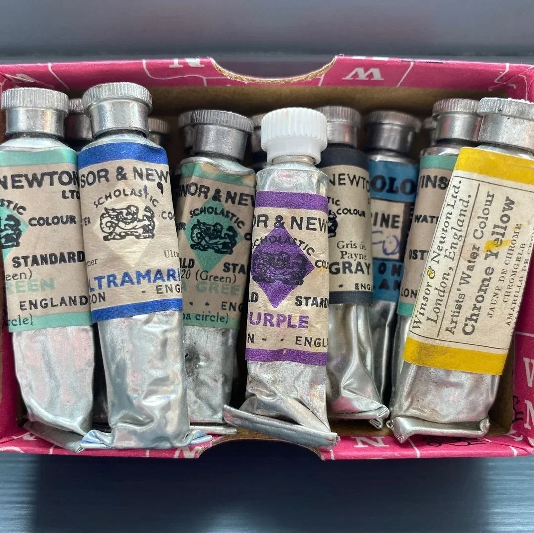
Painting is one of the oldest forms of art, dating back to the Stone Age with cave paintings, and has a wide variety of styles throughout the world in different eras. Turning into a vast medium that comes in different bases, like oil, water, plastic and many more. It is packaged in tubes or palettes. While being seeing as a more sophisticated form of art, being one of the main mediums shows in museums.
Acrylic Paintings
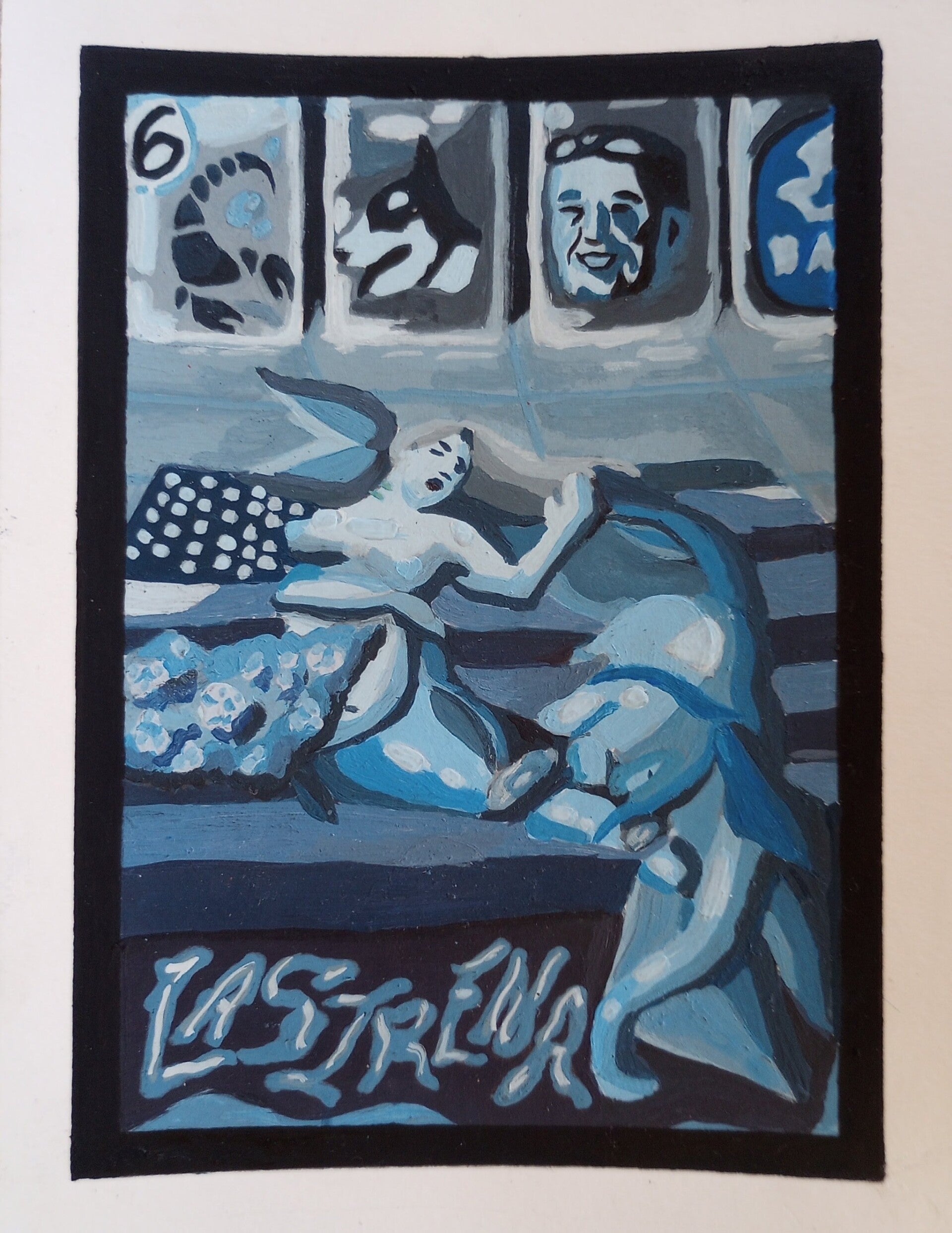
La Sirena: Monochromatic Blue
5X9 Each
Acrylic painting
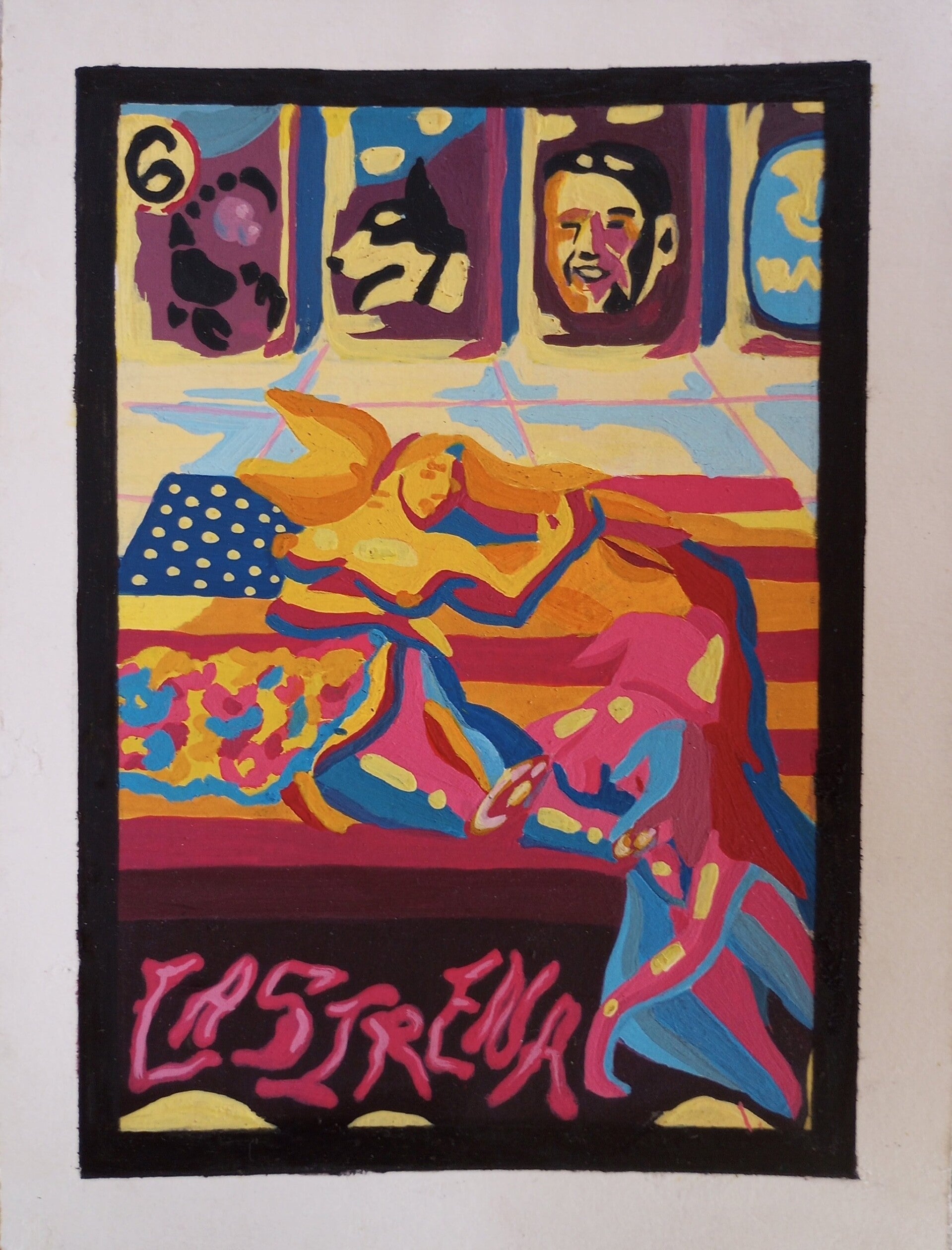
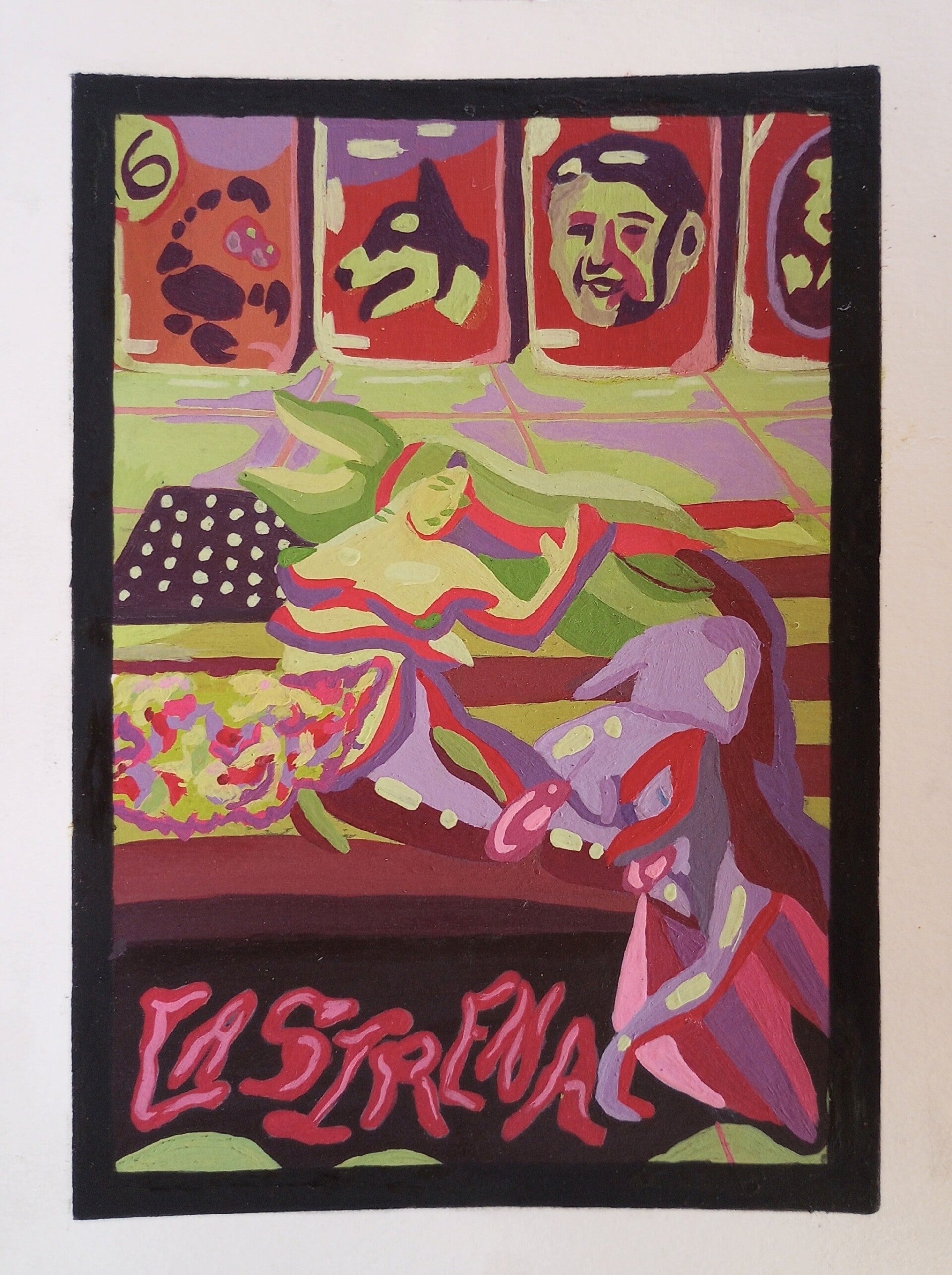
La Sirena was my Art 501 final, where we had to redesign a random lotería card and give it a new meaning. I got La Sirena. I redesigned the card based on the 56 US military inventions across Latin America throughout the 1950's-2000's specifically with my parent countries Guatemala and El Salvador. Each element represents something that is either attached to the history or to me. Showing how the US views Latin countries as something exotic that's then exploited, left in ruin, and cast aside.
The two sirens in the middle represent my papa, who is a Pisces. There is a Chiquita sticker on one of the bottles in the background representing the United Fruit Company (now Chiquita) that lobbied the US to overthrow the Guatemalan government, stating it was a “communist country” since Guatemala introduced progressive policies from the democratically elected President Jacobo Árbenz, like giving land to landless citizens and introducing labor rights. The scorpion in the bottle represents my mama, who is a Scorpio and a person who was also affected by the military invasions. The face of Ronald Reagan is also seen on one of the bottles since he was the president at the time and supported legislation that contributed to the Salvadoran Civil War. The face of my dog Shayla is there because during this time she passed away when I wanted to add her into the painting to commemorate her. The US flag is also shown as a cutting board, and the eggs and blood being shown show the US killing men, women, and children who looked indigenous or had an indigenous name.
For Monochromatic Blue, I wanted to have a cold, sad feel, and I painted mainly in blue tones throughout the painting. It was the messiest painting of all four since it was the first one I did.
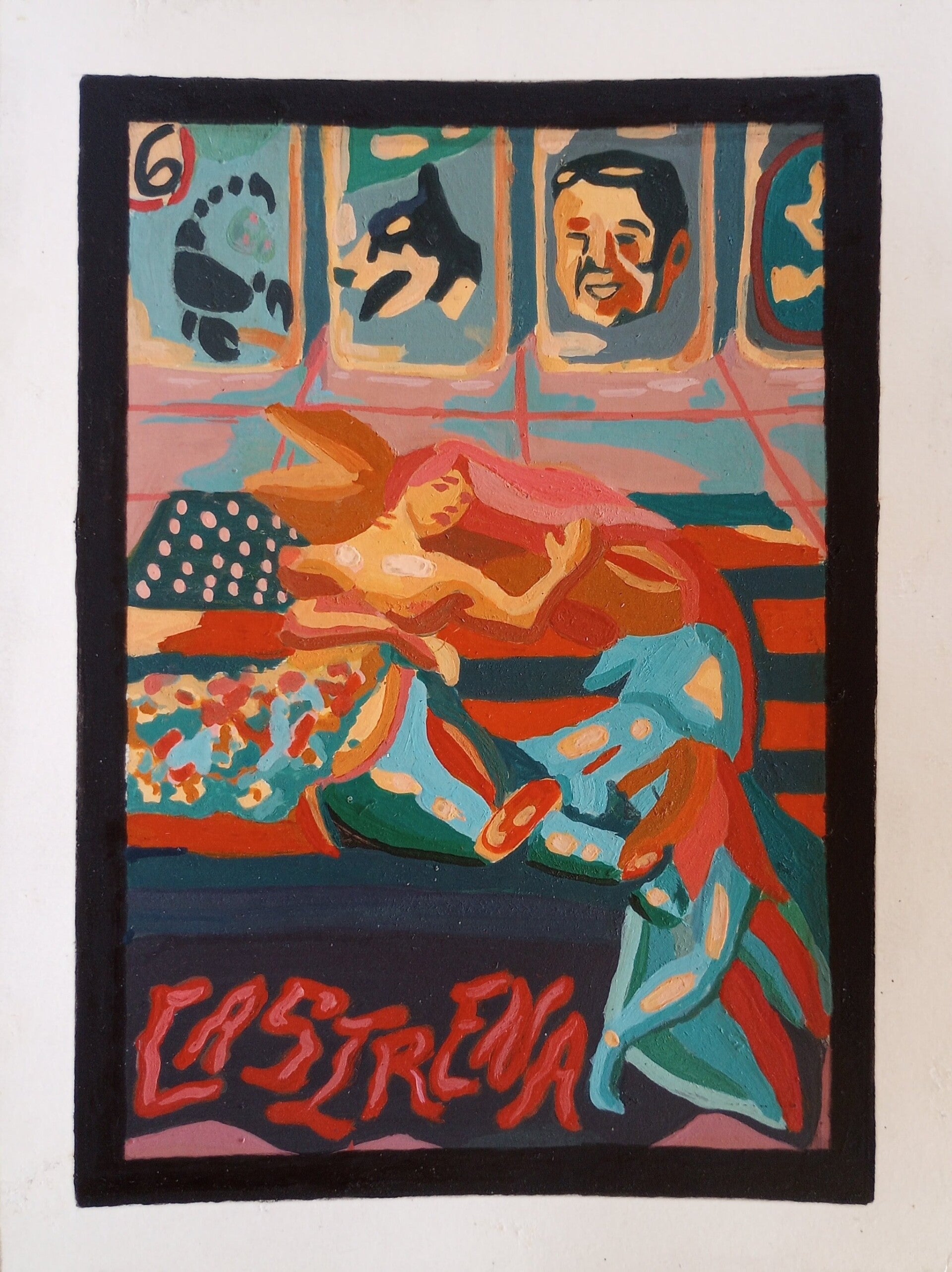
La Sirena: Complementary Red-Orange and Blue
5X9
Acrylic painting
For Complementary Red-Orange and Blue, I really wanted to have a fiery color contrasted with a cooler color. Something like a goldfish in a wonderful blue tank. This painting was a bit more challenging to paint since I had to figure out which sirena was going to be what color. It was less messy than the first painting but still not as clean as I would want it to be.
La Sirena: Triad Primary Colors
5X9
Acrylic painting
For Triad Primary Colors, I originally really wanted to depict painting with secondary colors, but in the end I chose primary colors. I wanted the primary colors to have an eye-bleeding look, but my Professor said to paint in tones since painting with primary colors is fairly difficult to do. But I do love the way it came out; the colors go well together while having a playful look to it. I especially love how I painted in the tiles, and my painting has become less messy and more crisp.
La Sirena: Split Complementary Red, Yellow-Green, & Purple
5X9
Acrylic painting
For Split Complementary Red, Yellow-Green, & Purple, I wanted to do the secondary colors; however, I had already done a triad, so I couldn't anymore, so I opted for the next best thing, which was having green, purple, and a tonal red to make it look somewhat orange. But in order for this to happen, my green had to be a yellow-green, and I made it work. I love the way it came out; it has a Halloween feel to it, and it was the fastest and cleanest painting to make out of all four of them. My favorite parts of the painting would be the green faces and the tiles.
Create Your Own Website With Webador